10 top tips when using on screen drawing tablets
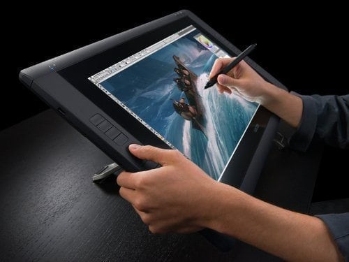 How to enhance your experience using digital drawing tablets with screens
After using tablets for over six years I often take for granted some of the small adjustments and tips from other users I have found along the way. Tablets can be a fantastic tool and very frustrating as well. It’s often easy to carry on regardless and not overcome some little niggles because you are too busy drawing to fix them. For the first time user the drawing experience in digital art can be more about overcoming technical mastery than drawing. Here are some simple tips to make your graphic drawing tablet experience better leaving you to do what you do best – draw!
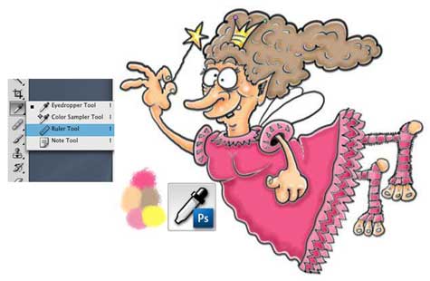 Digital color swatches and how to reduce time manipulating them.
When you are adding different colors to your design particularly when using a painting tool or shading in colored areas it can be a real pain to either have the color swatch menu taking up screen space or having to constantly open and close the color palette. I tend to put several blobs of color on the image that I am working on then hide the color swatch palette. I can then simply use the color picker (looks like an eye dropper on the tool menu) to select different colors. When I am done its simple to erase the blobs of color. This is a simple way how you can increase your drawing time.
Digital back painting for a cleaner graphic finish
I used to produce cartoons by scanning the ink drawing then coloring each section with the base color. The problem with this is that there is always rough edges between the original image ink and the color which needs quite a bit of time tidying up. Instead I now scan in the image and remove all the white space throughout and create a new white layer underneath. I then add the color on a new layer between the white base and ink image and it doesn’t matter if you run outside the areas you are coloring as it’s much easier to adjust in this way as you are not fighting against two different drawing edges (color and ink outline).
I have taken this a step firther where I eventually ‘over color’ the black edging to produce a less harsh outline and a more natural cartoon look to my drawings. This is possibly the best top drawing tip to save time and give a slightly different look to your cartoons.
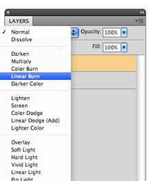 Scanning adjustment for stronger outlines.
I use Photoshop as my choice of graphic design software and have always found scanning a problem. Once the scan is imported into Photoshop the ink line-work tends to have a grey look and does not appear to be as sharp as the original. There are several ways to overcome this but the most effective I have found is to duplicate the layer and on the layer pallet in the drop down menu select linear burn and move the opacity slider down to around 50% (or whatever % looks best on screen for you). Then by selecting layers/flatten image you now have a sharp ink outline for your drawing.
Saving work as you progress
This may be stating the absolute obvious but always ALWAYS save your digital artwork frequently. Not just as a file backup but it is often a good idea to duplicate layers (such as the original scan) and hide them on the layers palette as an insurance policy so that if things go horribly wrong all is not lost. It still annoys me the number of times I have lost hours of work because of a stupid mistake or a power cut. I always save work regularly and duplicate critical layers on the layers palette.
Filing and cataloguing your digital artwork
If you are a serious artist you will build up a significant body of work. I recently needed an image for a blog post and I remembered creating a cartoon of a man with a puzzled look on his face a few years back. Luckily I have realized that an efficient filing system is essential otherwise you can end up redrawing the same work as its less time consuming than searching for the original, which is absolute madness! I have devised a system of files of dates and categories so that I can find any cartoon easily. This often means duplication of files and more storage space but believe me it is well worth doing.
How can you overcome the different feel of a stylus digitizer on the plastic graphic tablet screen?
This is a common problem and is a case diving straight in and getting used to it. However there is a way to break you in gently and that is to add drag to the screen surface. Draw your image conventionally on paper (80gsm max paper to allow light to pass through). The paper should be cut to fit the screen size. And taped on. You then trace your image with the stylus onto the screen which may seem bonkers at first but soon gets you into the groove of digital drawing using the same surface feel you have been used to. Once you have got over your drag inhibitions you can either jump staright to on screnn digital drawing or keep a plain sheet of paper taped to the screen until you are more confident. Most graphics tablets have a slightly textures surface to emulate the feel of pen and paper.
Backup your digital artwork library regularly
Again this is obvious but I have seen several cartoonists who have lost a huge amount of work due to computer or storage failure. I recently had a 1 Terabyte external hard drive that stopped working and lost everything on it. This was an inconvenience rather than a disaster as the main computer also has duplicate files. If this had not been the case I would have lost over 10 years of work which does not bear thinking about. External storage devices are relatively cheap and well worth the investment. If you have not got a backup – Get One!
Digital color shading method for consistent blends
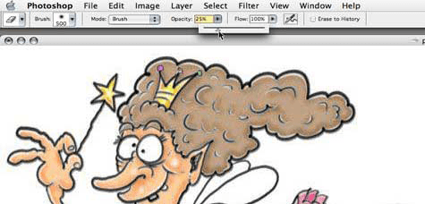 The most effective was to get the shading colors to match is to make use of the opacity levels (on the brush menu) rather than selecting different colors off the color swatch palette. The base color on your drawing, e.g. an area of blue sky, should be 25-50% opacity of the original color on the color swatch. You then have the opportunity to use a darker version (above selected % opacity) and lighter version (below selected % opacity) to make the lighter and darker shading areas with the same color tone qualities. This can be very effective in gradually and effectively blending shade tones using variations of color levels.
Cropping using the ‘perspective’ feature.
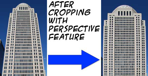 Cropping is a tool to select the area in the image you want to show while removing the parts that you don’t. For example you may have scanned in a sketch, which has a mass of unnecessary white space around it. Cropping focuses on the image and removes the white space. Cropping has its limitations as the normal mode allows rectangular/ square crops only. There is a feature in the Photoshop crop tool that gives more control over where you can crop. Select the crop tool then tick the perspective box (on the header bar) which then allows you to move and pull the corners of the crop area (by holding down the command function while dragging) to where you want them to go. One thing to remember – when you hit the return key to make the crop the selected area will convert to a square/ rectangular shape and some distortion may occur. This feature is particularly useful on photos of high buildings (see above) where converging angles occurs and look as if the external verticals are leaning in towards each other. The perspective feature can be used to ‘pull walls out straight’. It’s worth acquainting yourself with this feature as it does come in handy. Photoshop Elements 13 is a cut down and very affordable version of the more expensive full version – More information on Elements 13 & latest prices…
Make your digital drawing tablet work for you
You have your new on screen drawing tablet up and running and are well into creating some fantastic digital images. If you are like me I love to get stuck in and draw, draw, draw! One thing that I am guilty of is not reading the tablets instruction manual closely enough. After researching so many digital tablet specifications it was obvious that I was missing out as I was using the default settings. Take time out to read up on your tablet as you will be able to customize the settings to take your drawing experience up a gear. You should be able to alter axis and angles to suit your drawing style for better comfort. You can also customize the stylus digitizer controls for sensitivity and pressure. These are two essential basic areas that you can look at to make your graphic tablet truly your own.